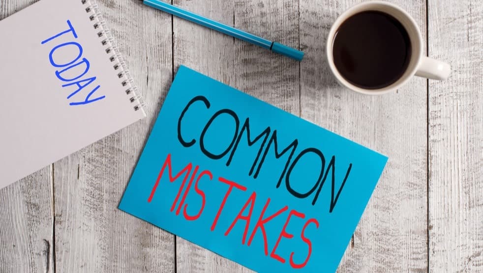
There are lots of things that can potentially hurt your blog, but most of them are so minor as to make almost no difference at all. Most of your time should always be spent on creating content and marketing, but there are a few common mistakes that can significantly impact user experience.
Fortunately, these mistakes are easy to fix. So let's take a look at them.
Large Home Page Slider
These are the sliders that take up a large area at the top of the Home page. They usually have multiple images that you can move through by clicking an arrow or a dot. Some sliders are set up to scroll automatically through the pictures.

While these sliders might look great, they can slow down the loading speed of the page, which in turn will cause the ‘bounce rate’ to increase. The bounce rate is a term that describes the percentage of users who leave your blog without interacting. Interacting could mean viewing a post, clicking through to another page on your site, watching a video, or any other action at all.
Bounce rate is measured as a percentage. For example, if 100 people visit your blog and 50 of them leave without any interaction, the bounce rate is 50%.
Several things can influence the bounce rate, such as a poor layout or confusing navigation. However, a slow loading site is one of the main reasons users leave a site without interacting. In general, people are impatient, and they don’t want to wait an extra few seconds for a page to load.
Are there websites with big Home page sliders that load fast? Yes, but these sites are usually hosted on expensive dedicated hosting servers costing a few hundred or even a few thousand dollars per month. For most bloggers, this is not an option.
If you decide you still want to use a slider, what are the alternatives?
Use a small slider in a widget (content) area on the Home page. For example, you could place a slider at the top of a sidebar, as in the screenshot below.

Or, if you still want to use a large header slider, use it on a page that is not your Home page. BTW, the Home page is the main page of your site. For example, buildthatblog.com is the address of the Home page of this site.
Pop Ups (If Not Used Correctly)
There are several different types of pop-ups.
Lightbox pop-ups appear as a smaller window, while the page behind the pop-up goes dark. They are used commonly for email signups, or coupons, and other deals.
Full-screen pop-ups cover the page entirely or almost entirely.
Bar pop-ups are bars that appear at the top or the bottom of the page—often used for special offers or announcements.
On-click pop-ups appear when the user clicks on a link. An example of an on-click pop-up could be an email opt-in box that appears when the user clicks on a link that says, 'Subscribe Here.'
Exit pop-ups appear automatically when a user takes action to indicate that he/she is about to leave the site. An exit pop-up can take the form of an offer, an email opt-in box, or something else. Either way, the purpose is to grab the user's attention just as they are about to leave.

When used correctly, pop-ups can benefit your blog by helping you to build a list of email subscribers and make more sales. Used incorrectly, they can annoy your readers and even negatively impact your blog's search engine rankings.
It's worth always keeping in mind that search engine rankings are led by user experience. Anything that negatively impacts the user's experience on your blog, will in turn, negatively impact your blog's rankings.
To use pop-ups in a way that does not hurt your blog, use them sparingly and as much as possible target them to the reader's interests.
An example of a highly targeted pop-up would be a lightbox offering a free guide 'How to Travel Around Canada for Free' that pops up while the user is looking at a blog post about traveling around Canada 🙂
Confusing Post Titles
Post titles should convey the subject of the post.
If they don't, users are less likely to click through from another page on your blog and less likely to click through from the Google search results.
Although it's essential to write titles that capture attention, it's equally important to write clear titles that users can instantly understand.
For example, this title is self-explanatory. You know immediately what the post is about and what to expect from it.
3 Steps to Perfecting Your Cursive Writing Skills
In contrast, this title is ambiguous and doesn't tell you exactly what the post is about.
Getting Better Skills with 3 Handwriting Steps
Outbound Links (not using them can be harmful to your blog's SEO)
Often, new bloggers are afraid to add links going out to other websites because they don't want any of their readers to click away somewhere else. It's a common concern, but it's not logical.
The reason it's not logical is that if a user wants to leave your blog, they will do it anyway. And if they're going to stay, they will stay anyway! In any case, you can set outbound links to open in a new window. That way, when a user clicks on one, your blog page will stay open.

Not adding outbound links can be harmful to your blog's search engine rankings because links to high-quality, relevant sites can give it more authority in the eyes of Google and the other search engines.
So, depending on the length of the blog post, add at least one outbound link in each.
Slow Loading Images
As your blog develops, the number of images you have on your posts and pages will increase. Ultimately you will have 100’s if not 1000’s of images.
Since images often load more slowly than other content, they can slow down the loading speed of an entire page. Even one slow loading image can be enough to create a high bounce rate on a page (remember the bounce rate?).
"The bounce rate is a term that describes the percentage of users who leave your blog without interacting."
Content Delivery Networks, or CDN’s for short, are places where site owners can host all the images on their website. Images are delivered via the CDN and, as a result, load much faster. CDN's can also be used for delivering other types of file too.

Some hosting services (including our recommended hosting service), have a CDN built-in at no extra cost.
As well as using a CDN, you can use an image optimization plugin to compress the size of the image, making the size of the image file smaller while maintaining the original dimensions and quality.
Siteground hosting has a built-in optimizer that provides image compression as default, but if you are using a hosting provider that does not have this feature, you can install a plugin like 'Smush', which will do the same job.
Fonts
Your choice of font style, size, and color is important.
Using a harder-to-read style or a style that looks unusual and not what users expect can negatively impact the time a user spends on your blog.
Unusual or quirky font styles can seem like a simple way to give your blog a unique touch. But numerous studies have shown that people prefer plain, easy-to-read font styles.
This might look cool, but it could could really hurt your blog!
If we take an example like Amazon, millions of dollars are spent every year on testing to ensure that their websites are as user-friendly as possible. Therefore, we can confidently say that using font styles like theirs is a safe bet. It's not just Amazon either. Look at any large website. They all use plain fonts.
Quirky fonts can look okay (and even add a nice touch) when used very sparingly, for example, in the header as the blog title. But using them in the content is generally not a good idea.
Font size matters too. Small font is harder to read. Reading a blog post should be effortless, and when it's not, users will leave and go somewhere else where it is effortless. I recommend using no smaller than 16 px. In case you're wondering, this article is using a font size of 18 px.
This is what it would look like using a smaller, 14 px font size.
As well as style and size, consider the font color. A common mistake is to use a font that's too light, making it hard to read on a white background. Font doesn't need to be black, and in fact, the font you are looking at right now while reading this article is not black, but it's dark enough to make it very easy to read on the white background.
First Impressions
While content will always be the single most crucial element determining how successful your blog will become, first impressions still matter.
They matter because when a new user visits your blog for the very time, they will judge it based on what they immediately see.
That judgment may or may not be fair, but they will make it anyway because that's human nature!
So, What Can You Do to Make a Decent First Impression?
If you don't have one already, add a logo to the header of your blog. A logo should have a transparent background; otherwise, it looks amateurish.
If you are using a header image, make sure that it's attractive, engaging, relevant to the blog's subject, the right size, and high definition (not pixelated, stretched, or blurry).
Don't have too many ads above the fold. Above the fold is the part of a page that a user can see before scrolling down.
Don't annoy the visitor with a pop-up that appears too quickly after they have arrived on your blog.
Use an established and proven theme for your blog. Well-developed themes look the part and help to create a good first impression. Keep in mind that it's possible to change themes at any time.
Think about the colors you are using. Mismatched colors can contribute to a poor first impression. We don't all have an eye for which colors go with which, but fortunately, help is at hand!
Huesnap is an excellent resource color matching, as is Palettte.
To read about colors, what they represent and how they affect us psychologically, go to Colormatters.
To conclude. The above is not a definitive list, but it does cover the mistakes that I’ve witnessed the most over the last five years while teaching blogging and after seeing many new blogs created by students (some of which have been amazing 😊 ).

